THE LEVEL DESIGN OF THE ALDI PARKING LOT
One of the key differentiators in our game is our approach to challenge. Indeed, this is part of what makes level design in Monsters ‘N Trucks a bit less straight forward than in your typical video game.
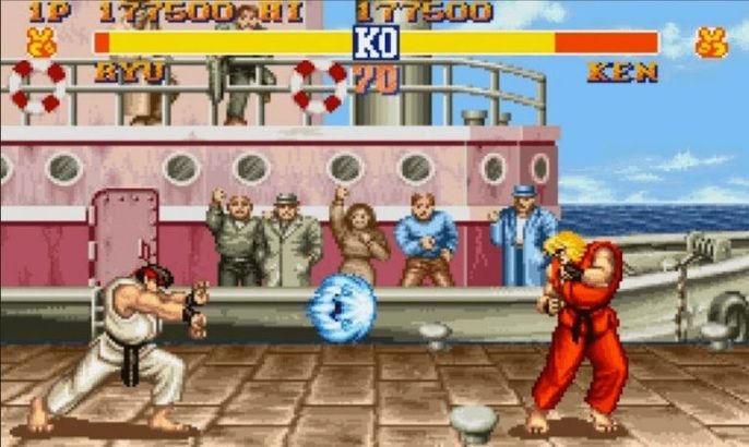
In general, video games are exclusionary: they require players to pass challenges in order to progress to the next level, to keep playing. Oftentimes a bar must be passed simply to be counted among the players of any given video game.
This mentality is borrowed from sports - the elite move up, the rest step aside.
But “games” should be different. Games are about challenge, sure, but it’s more about the fun - the shared elation in overcoming the challenge. The challenge isn’t a bar for entry to the club, it’s there for fun.
This is the mentality I want to have in Monsters ‘N Trucks. The challenges should make the levels more interesting, but not deter the player from playing.
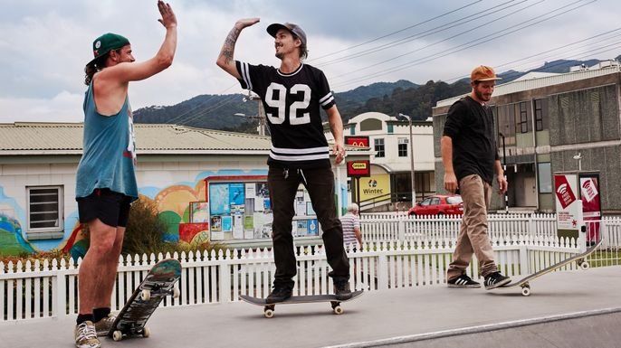
I was never into the us vs. them mentality of traditional sports, and therefore as a young lad I found myself skateboarding. Skateboarding was - and still is, mostly - an anti-competitive sport. You had challenges, but whereas traditional sports pit you vs them, skateboarding was more man vs environment. Challenges were both internal and shared. Victory was cheered by your co-competitors. This seems to me a much more natural area for games. (See the popularity of Twitch, gamer YouTube videos as evidence of this)
Anti-Competitive Game Design
This got me thinking about how this anti-competitive attitude of skateboarding should inform level design. When my friends and I would skate, we could skate pretty much anywhere and yet we ended up frequenting certain areas.
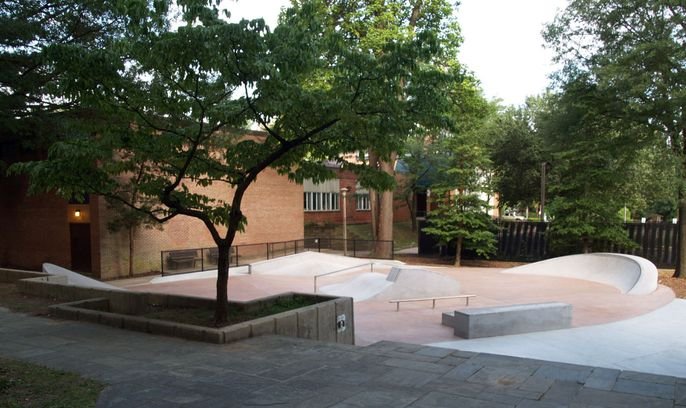
Where we skated varied a lot, but it was mostly based on the idea of a “spot”. A spot would revolve around a single powerful element - a dangerous staircase, an empty lot, a fun hill, etc. We’d meet at such a place and session until we got bored, hurt or the cops showed up.
Elements of Great Spot
When thinking about these spots, the one that ruled them all was the ALDI parking lot. This was the place we met at most frequently, and birthed the most legendary moments. What was it about the ALDI parking lot that made it so special?
Skills - There were curbs and stuff you could work on new tricks
Chill - There was a big hill, you could coast down, get going really fast, it was awesome.
Danger - AKA Thrills. There was a double staircase that tempted us all and left few survivors.
An interesting side observation is that, while each of these could be hit individually, one of the most fun things was to try to do a complete run, hitting all the elements. So while we think about these things as being more conducive to an open-world style game, if we approach the level design like a run through the Aldi parking lot, we can hopefully capture this kind of spontaneous joy, even in a fixed run.
TLDR:
Since we have relatively fewer levels → Levels should be “spots”, destinations.
Since path is linear and fixed → Levels should be internally varied in terms of challenge.
Reference
Tony Hawk Pro Skater seems like it would be an obvious reference source, but the gameplay in THPS relies heavily on the open world aspect. Since we can’t do that given gameplay limitations, the level designs in Pro Skater ends up being a lot different from ours.
The Guitar Hero series, on the other hand, has this same approach to “session” style gameplay, and when we design levels, we can look to this series for inspiration.
The best GH levels weren’t always the best songs. The progression and the level challenge had to hit just right, and they had to have the right balance of Skills, Chillz and Thrills.™
Note: I wrote this blog for our internal confluence page in mid-development. Thought it was interesting enough to share. No idea where the images originally came from, if you own one of them lmk and I’ll take it down. Unless you’re Capcom and it’s that Street Fighter image in which case… suck on my Fair Use, $#@%es.


